Marya is the lady behind one of my favourite film blogs, Cinema Fanatic: Diary of a Film Awards Fanatic. She has been kind enough to write this guest post for Uncultured Critic on films that, after the advent of colour, were filmed in black and white for artistic reasons. This will be the first in a series of guest blogs, so I hope you enjoy it! Be sure to check out Marya’s Tumblr, too!
Originally when the Academy Awards were first founded in 1927/1928, the Cinematography award was given for a body of work, which caused some problems if multiple cinematographers filmed one film as well as others individually. The next year there were no nominations and the third year films were nominated, not cinematographers. In 1931 they settled on awarding individuals based on their work on a single film. By 1939 the category was split into two – Color and black and white. It stayed this way until 1967, with the single exception of 1957. Since 1967 the only black and white film to win the award is 1993’s Schindler’s List. However, there have been several films that have chosen to film in black and white for artistic reasons. Conversely, 1967’s Bonnie and Clyde specifically shot in Technicolor because the producers did not want the film to seem like a documentary of the depression era; they wanted it to feel as modern as possible. I’d like to discuss some of my favorite films that chose to film in black and white.
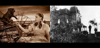
Before I do that, however, I have to talk about a few films that chose to film in black and white prior to the category change. The Wizard of Oz filmed the scenes that take place in Kansas in black and white (or sepia, rather) in order to emphasize the dream-like land of Oz when they switched to color. Hitchcock chose to film Psycho in black and white to keep a B-movie feel to his film.
One of the first films to come out after the Academy changed back to a single Best Cinematography category was 1967’s In Cold Blood, based on Truman Capote’s 1966 true crime novel of the same name. Conrad L. Hall’s cinematography is so lush and expressive, while at the same time highlighting the loneliness and desolation of the film’s plot. I definitely feel it was the right choice to make this film in black and white and in doing so the film was the first black and white film to be nominated for Best Cinematography in the new combined category. Incidentally, it lost the award to Bonnie and Clyde.
One of my favorite films to use black and white cinematography as an homage is the 1982 Carl Reiner helmed Steve Martin film Dead Men Don’t Wear Plaid. The film is both an homage to and parody of film noir. It contains some of the best editing I have ever seen in that Humphrey Bogart, who was long dead, had been edited into the film as Martin’s partner. 19 film noir films in total were edited into the new footage to create the complete film. It’s a shame that Michael Chapman’s cinematography and Bud Molin’s genius editing were completely ignored by the Academy. Chapman had been previously nominated for his black and white work on 1980’s Raging Bull, losing to the literary drama Tess. Many years later the Coen brothers made a neo-noir film, also shot in black and white – 2001’s The Man Who Wasn’t There. I’ve yet to see this film, but from what I’ve seen the cinematography is extremely lush. Roger Deakins was nominated for numerous awards for his cinematography; the film even landed at the #31 spot on The American Society of Cinematographers’ list Best-Shot Film From 1998-2008.
Francis Ford Coppola’s 1983 film Rumble Fish was one of the first films to mix black and white with color. Unlike The Wizard of Oz, the film doesn’t contain black and white sequences and color sequences, but instead infused black and white scenes with color. It’s little things, like the titular fish. Stephen H. Burum’s cinematography is particularly beautiful in this film and helps to create the unique otherness that the film exudes.
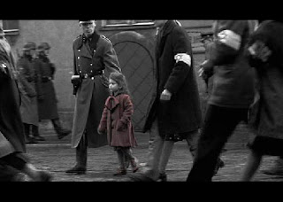
Much like Rumble Fish a decade earlier, Steven Spielberg’s 1993 WWII drama Schindler’s List utilizes black and white cinematography with one specific exception – the little girl’s red coat. Spielberg had set out to film the story like it were a documentary, which led to the decision to shoot the film mainly in black and white. Cinematographer Janusz Kamiński compared to German Expressionism and Italian neorealism. Spielberg has said that “[v]irtually everything [he’s] seen on the Holocaust […] have largely been stark, black and white images.” Kamiński went on the win for Best Cinematography at the Academy Awards, making Schindler’s List the only black and white film to do so since the category change of 1967.
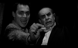
The following year saw Tim Burton’s comedy about the life of B-movie director Ed Wood. Originally the film was in development with Columbia Pictures. However, when Burton decided he wanted to shoot the film in black and white, the studio balked. Burton has said that black and white was, “right for the material and the movie, and this was a movie that had to be in black-and-white,” and insisted on total creative control. A month before the original start date, Ed Wood was put into turnaround sparking interest in the film from Warner Bros., Paramount Pictures and 20th Century Fox. Eventually Burton accepted an offer from Disney. Despite Academy Award nominations for Best Make-Up and Best Supporting Actor – Martin Landau (he won), Stefan Czapsky’s cinematography was largely overlooked.
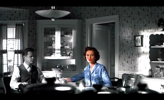
Arguably the greatest mixture of black and white and color cinematography can be found in 1998’s Pleasantville. The film does so much mixture of the two styles that there’s a screen before the DVD/VHS to help you adjust the color on your television so it will be just right. Part special effects, part wildly original cinematography, Pleasantville’s use of color and black and white to tell its story is jut plain fun. The film was nominated for three Oscars – Costume Design, Set Decoration and Score. How it did not receive a nomination for its visual effects or John Lindley’s cinematography is just beyond me.
Quentin Tarantino’s epic Kill Bill films utilize black and white both to establish events that take place in the past but also as a way to get the uber-violence of the film past the MPAA board. According to its trivia section on IMDb, the black and white cinematography is an homage to ’70s and ’80s US television airings of kung fu movies, black and white having been used to conceal the shedding of blood from television censors. Tarantino apparently used the old trick for its intended purpose, rather than merely as an homage. I think cinematography Robert Richardson achieved some really beautiful shots, with added depth, with his use of black and white.
I am a huge fan of Frank Miller’s Sin City graphic novels and Robert Rodriguez’s 2005 film adaptation is perhaps one of the greatest adaptations I’ve ever seen. Somehow this film received ZERO nominations at the Academy Awards. I think maybe it was just ahead of its time. The film was completely filmed in green screen and then digitally enhanced. The use of color and black and white perfectly mirrors the way in which color is used in the graphic novels. It is a truly beautiful film.
George Clooney’s 2005 film Good Night, and Good Luck utilized black and white cinematography in order to contextualize the film’s setting – McCarthy-era television. Apparently the film was shot on color film stock, set to grayscale and then was later color corrected to black and white during post-production. Regardless of how the black and white was achieved, the film’s weighty subject is highlighted by the gravity of the black and white cinematography. Cinematographer Robert Elswit was nominated for his work on the film, ultimately losing to Dion Beebe’s work on Memoirs of a Geisha. Elswit would later win the award for the 2007 film There Will Be Blood.
Control, Anton Corbijn’s 2007 biographical film of Joy Division lead singer Ian Curtis, is one of my all-time favorite films. Partly because Joy Division is my favorite band, but also because the film is in itself a beautiful work of art. Like Good Night, and Good Luck. the film was shot on color stock and printed to black and white. Corbjin decided to shoot the film in black and white, “reflect the atmosphere of Joy Division and the mood of the era.” As a fan of the band, I can tell you there is hardly a photograph or video of band that is in color. When you think of them you think in black and white. Corbijin, who began his career as a rock photographer, is actually responsible for many of the most iconic images of the band.
One of the most recent black and white films is the 2009 Michael Haneke drama The White Ribbon (Das weiße Band, Eine deutsche Kindergeschichte). I still haven’t seen this film but I hear it is absolutely fabulous. The film was a front-runner for the Best Cinematography Oscar, having won several precursors. Christian Berger’s work did receive a nomination, but ultimately lost to Mauro Fiore’s work on Avatar. This win sparked many a debate among industry insiders in regards to the future of the art of cinematography in a digital age.
There has actually been hundreds of films in the last forty years to use black and white as an artistic choice. Some notable films I have yet to mention, some I’ve seen, some I have not, include: The Last Picture Show, Young Frankenstein, Paper Moon, Eraserhead, Manhattan, The Elephant Man, Wings of Desire, Clerks (although the choice to film in black and white was not an artistic one, but rather due to budgetary constraints), La Haine, American History X, Celebrity, Coffee and Cigarettes, Angel-A, The Good German and My Winnepeg.
Click here to see my guest post at Cinema Fanatic.


